As the Chinese New Year approaches, the shopping frenzy in the Asian communities’ kicks into high gear, shaping a unique consumer landscape at this time of the year. The heightened excitement this year is fuelled by the arrival of the Year of the Dragon, a zodiac symbol synonymous with power and prosperity in Chinese culture.
In response to this fervour, brands are unleashing their creativity, crafting novel packaging and point-of-sale material (POSM). The goal is to captivate the interest of eager shoppers and resonate with the symbolism valued by Asian shoppers. This involves incorporating elements from Chinese culture, such as dragons, red and gold colouring, Chinese calligraphy, paper-cut designs, and themes from mythological stories.
By doing so, brands aim to establish a deep connection with shoppers, positioning themselves as a brand that not only understands but actively embraces their culture. This strategy characterizes them as an international brand deeply attuned to the nuances of local consumer habits—a true manifestation of a “glocal” brand.
/Packaging%20Festive%20Appeal%20Introduction%20image1.png?width=853&height=480&name=Packaging%20Festive%20Appeal%20Introduction%20image1.png)
In this article, we'll discuss three key strategies for achieving success in packaging and point-of-sale materials, shedding light on how brands in Shanghai and Singapore capitalize on this spirited and lucrative market.
1. Visibility and Stopping Power
The first key strategy centres around maximizing visibility and stopping power, both in store and on shelf. To achieve this, brands incorporate eye-catching elements on the packaging that stand out amidst the array of products, instantly grabbing shopper attention at the aisle. Simultaneously, Point-of-Sale Materials (POSM) are strategically designed and placed to interrupt consumers’ routine shopping paths in grocery stores.
How do we boost visibility & stopping power?
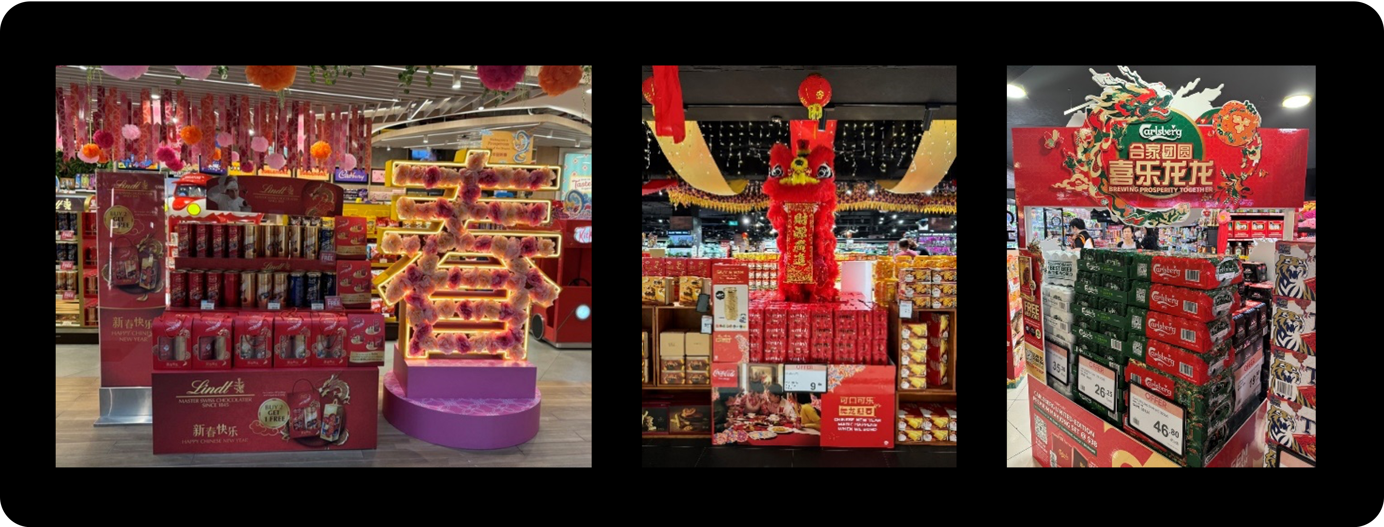
a) Engage shoppers on a sensory level. Vibrant colour schemes, including the iconic Chinese New Year red, act as a visual magnet, capturing attention and eliciting positive emotions such as excitement. In Shanghai and Singapore, red and gold are the essential colours for Chinese New Year packaging and POSM. Size plays a crucial role - large POSM installations that create striking visual spectacles can elevate shopping to an immersive, multi-dimensional experience that goes beyond the conventional.
Lindt’s POSM features a radiant Chinese character of "spring," (春) enhancing the festive and celebratory ambiance. This eye-catching installation has a prominent presence in the store, impossible to overlook. However, the colour of the product shelf appears dull and muted and may easily go unnoticed by shoppers, missing the opportunity for brand visibility.
Conversely, Carlsberg’s logo is visible in the top banner, as well as on the red packaging. The Carlsberg green is overall highly visible throughout the POSM, ensuring heightened visibility for both the POSM and the brand itself.

b) Boost vibrancy within the 2D ecommerce environment. In the context of ecommerce, capturing the attention and engagement of shoppers through a 2D display poses additional challenges. However, some brands distinguish themselves by crafting a more immersive online experience, surpassing their counterparts, by incorporating design elements that simulate movement. This approach can involve leveraging visual techniques, such as dynamic patterns, optical illusions, or clever arrangements of elements, to give the illusion of movement and dynamism on a flat screen.
/Boost%20vibrancy%20within%20the%202D%20ecommerce%20environment..png)
Take, for instance, Lang (郎), a Chinese liquor brand featured in the rightmost image. Through the clever use of swirl patterns and product placement, Lang creates an optical illusion of movement for its products, instilling a sense of dynamic energy rather than static presentation. The clouds and ribbon in the second and third examples below achieve a similar effect, contributing to an engaging visual narrative.
c) Cultivate a novel narrative that is sharable. Novelty in packaging and POSM invites shoppers to explore beyond mere visual inspection, sparking the curiosity that encourages a longer and more focused interaction with the product. The impact is heightened when brands create designs with the potential to go viral. The key lies in crafting a unique story that encourages shoppers to eagerly share within their communities. (This sharing culture is particularly influential in China, where social media is deeply ingrained in daily life.) As a result, the packaging and POSM not only garner visibility within stores but also extend their influence beyond the store environment.
For example, Lay's adopts a packaging design resembling a giant "qian" (签), a Chinese form of fortune-telling or divination where individuals draw a random stick or lot from a container to receive predictions or guidance. While this concept might be unfamiliar to those not versed in Chinese culture, bringing home a Lay's product in this symbolic form represents carrying a stick of good luck with you.
/PRS%20IN%20VIVO%20Captivating%20Packaging.png?width=4734&height=1677&name=PRS%20IN%20VIVO%20Captivating%20Packaging.png)
Other examples of captivating packaging and POSM include Cadbury's pull-out dragon tail, which adds an element of fun and interactivity. Similarly, Milo's dragon face design exudes charm and cuteness, appealing to shoppers' emotions. F&N's dragon visuals showcase vibrant colours and fluid movements.
2. Addressing Shopper’s Jobs To Be Done
The second key to successful Chinese New Year packaging lies in the "Jobs to be Done" concept—a framework that delves into the motivations driving individuals to choose a product for specific tasks. To succeed, the package must clearly convey how the product aligns with Chinese New Year usage contexts, addressing specific tasks, to activate shoppers’ goals and motivate them to engage. Although price still influences shopping decisions, the festive season often inspires a readiness to spend slightly more to partake in the New Year celebrations.
a) Gifting: Chinese people present gifts during house visits to family, relatives, or those they wish to form strong connections with, expressing goodwill and symbolizing prosperity. These gifts usually revolve around snacks, tea or wine, gift baskets, and wellness. The selection of gifts is heavily influenced by the packaging. Aesthetically, the favoured gifts often feature celebratory elements such as vibrant colours and symbols of good fortune. On a functional level, emphasis is placed on packaging that is convenient and easy to carry.
/Oreo%20Chinese%20New%20Year%20Packaging%20Image.png?width=4656&height=2108&name=Oreo%20Chinese%20New%20Year%20Packaging%20Image.png)
For example, brands incorporate elements such as ribbons and strings, giving their packaging the appearance of a gift wrap and enhanced convenience, making it easy for consumers to carry and share the treats with friends and family. Oreo is noteworthy for introducing a limited edition with red cookies, elevating its appeal as a ‘collectible’ and capitalizing on the fear of missing out, a particularly prevalent mindset among Chinese shoppers.
b) Bringing the festival home: Bringing the festival home is significant during Chinese New Year as it aligns with the cultural emphasis on family, reunions, and the symbolic importance of creating a festive and auspicious atmosphere within the home. It is a time-honoured tradition that fosters a sense of togetherness and optimism as individuals welcome the new year surrounded by loved ones in the comfort of their homes.
In Shanghai, Lay's exemplifies a thoughtful approach by creating limited edition packaging resembling a red lantern, a common New Year decoration for Chinese households. This innovative design serves a dual purpose – seamlessly transforming from a snack container into an aesthetically pleasing Chinese New Year ornament.
/Coca%20Cola%20Chinese%20New%20Year%20Packaging.png?width=414&height=319&name=Coca%20Cola%20Chinese%20New%20Year%20Packaging.png)
Here, Coca Cola features in their POSM, theMoment of Consumption, which helps customers associate drinking Coca Cola during the reunion meal, which is an important time-honoured tradition during this festive time. The element of the dragon helps to also highlight this cultural emphasis.
Expanding on this concept, Oreo has successfully elevated (and expanded) the consumption experience with its gift box packaging that transforms into a handheld Chinese lantern, which is essential for lantern parades, a beloved and widespread activity among Chinese kids. This clever packaging design not only adds a festive touch to the treat but also doubles as an entertaining DIY activity, providing families with a unique and enjoyable way to spend quality time, particularly with children.
/Oreos%20Chinese%20New%20Year%20Packaging.png?width=274&height=280&name=Oreos%20Chinese%20New%20Year%20Packaging.png)
3. Retain Brand Equity
Ensuring a strong connection to local culture is pivotal, but it is equally crucial to maintain brand identity. It's a common mistake for brands to become overly immersed in incorporating Chinese New Year elements, potentially losing sight of shoppers' specific needs within a category. Successful packaging or POSM strikes a balance by seamlessly integrating cultural elements while upholding distinct brand cues. This approach ensures that consumers can effortlessly recognize the brand, tapping into established credibility and fostering a clear understanding of the product. Can consumers easily spot the logo? Are the brand's distinctive assets immediately recognizable? These are critical questions.
Our survey conducted with our in-house packaging experts, combined with an AI analysis of packaging through our proprietary Viz.AI™, unveils valuable insights into three Chinese New Year packs found in Shanghai and Singapore.
a) KitKat is a great example of retaining its brand cue by prominently featuring its signature red colour in its Chinese New Year packaging. This deliberate use of colour allows shoppers to effortlessly connect with the brand, making KitKat easily recognizable on shelf. On the pack, Viz.AI™ analysis shows that while the centrally positioned dragon captures shoppers' attention successfully, the attention to the KitKat logo follows immediately, establishing a compelling connection between the brand and the narrative presented by this packaging.
/Kit%20Kat%20Nestle%20Chinese%20New%20Year%20Packaging.png?width=760&height=400&name=Kit%20Kat%20Nestle%20Chinese%20New%20Year%20Packaging.png)
b) 100 PLUS (an isotonic sports drink brand) successfully adapts to a festive Chinese New Year theme by transitioning the colour of its can to gold, while maintaining its brand recognition through the continued use of its distinctive blue-red-green colour combination. Viz.AI™ analysis underscores the effectiveness in brand recognition, showing that the top elements in the attention hierarchy are all connected to the brand.
/100%20PLUS%20Chinse%20New%20Year%20Packaging.png?width=4656&height=2108&name=100%20PLUS%20Chinse%20New%20Year%20Packaging.png)
c) Milo, while entertaining, struggles to redirect shoppers' attention to its brand. Despite the dragon's direct gaze likely drawing considerable attention, the Milo logo might get lost within the complicated drawings on the packaging. Similarly, the image of the actual product in the bottom right corner fails to compete effectively for attention. Viz.AI™ analysis confirms that visibility of the Milo logo is lower in the attention hierarchy. Overall, the pack design lacks an intuitive connection to Milo.
However, point-of-sale materials (POSM) is likely to be more successful in enhancing Milo's brand and product visibility by prominently featuring the brand. This strategic display also makes it easier for shoppers to recognize that the dragon colour corresponds to the colour of the Milo logo itself.
/Milo%20Chinese%20New%20Year%20Packaging.png?width=4734&height=1677&name=Milo%20Chinese%20New%20Year%20Packaging.png)
Concluding our exploration of Chinese New Year packaging strategies, particularly inspired by the vibrant retail landscape in Shanghai and Singapore, a few key takeaways emerge:
- Maximize visibility to stand out on shelf and in-store
- Connect to JTBDs (Jobs To Be Done) and ensure resonance with shopper needs
- Preserve brand equity and recognition
With these strategies, businesses can navigate the dynamic realm of festive packaging design with a focus on engagement, recognition, and lasting consumer appeal.
For additional information or inquiries on how to leverage pack and POSM designs to enhance your brand with shoppers, reach out to:
- APAC: Sophie Mahe (Sophie.Mahe@prs-invivo-group.com)
- Europe: Olivier Bardin - O.Bardin@prs-invivo-group.com
- US: Tom Dilley (Tom.Dilley@prs-invivo-group.com )

/Lays%20Packaging%20Example-1.png?width=258&height=390&name=Lays%20Packaging%20Example-1.png)
/Lays%20Chinese%20New%20Year%20Packaging.png?width=258&height=331&name=Lays%20Chinese%20New%20Year%20Packaging.png)

/Amalina%20Hamdan.jpeg)


